Personal
A public space where I document my journey exploring technology and art.
- TypeScript
- JavaScript
- Astro
- Threejs
- Css
- Aws
- illustrator
- Photoshop
- Figma
- Blender
Project Overview
My goal was to build a personal website that felt clean, modern, and had personality. I wanted to show I could build a site from the ground up, from initial design all the way to deploying it live. But it’s also a place for me to share my journey as I explore tech, art, and other random things.
I hope to learn from it, share with others, and have something to look back on when I feel a little lost. On top of that, I really wanted to get back into writing. It’s been a long time since I’ve written an article about anything.
Design and Asset Creation
Logo and Brand Assets
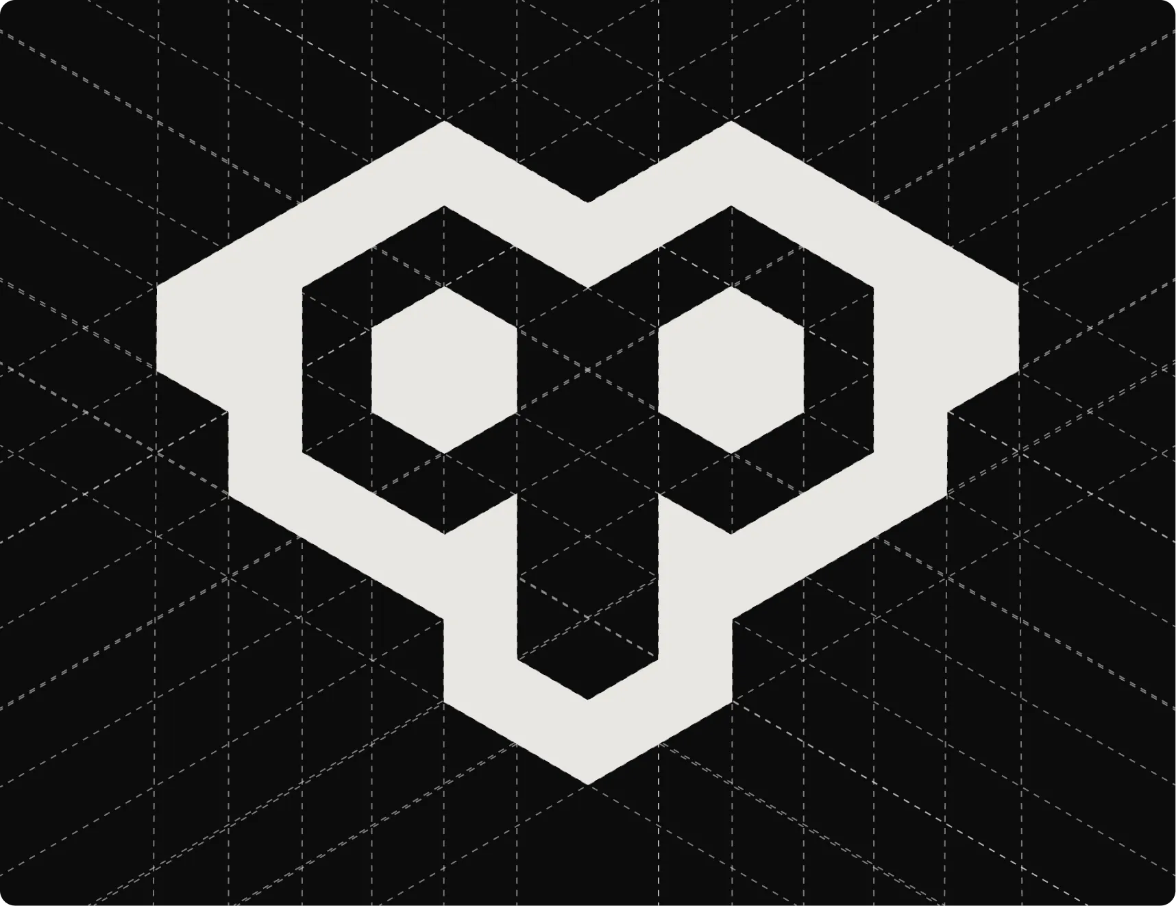
To create the logo, I took inspiration from a few things: owls, primates, and the letters ‘p’ and ‘g’. Before landing on the final version, I experimented with all sorts of logo types, from pure typography to different shapes and combinations of the two.
My Process for Creating the Logo
I don’t believe in hard rules for making a logo. You can do whatever you want, as long as you or the client is happy. I like having a consistent approach, but I don’t follow it strictly.
- Gathering References: Gathering references is a huge help when creating a logo. It can be anything, really, even just other logos you like. I use them for inspiration.
- The Silhouette: The silhouette is crucial. The logo’s shape should be recognizable whether it’s zoomed way in or out. For a shape-based logo, I test this by shrinking it down to favicon size, about 20x20 pixels.
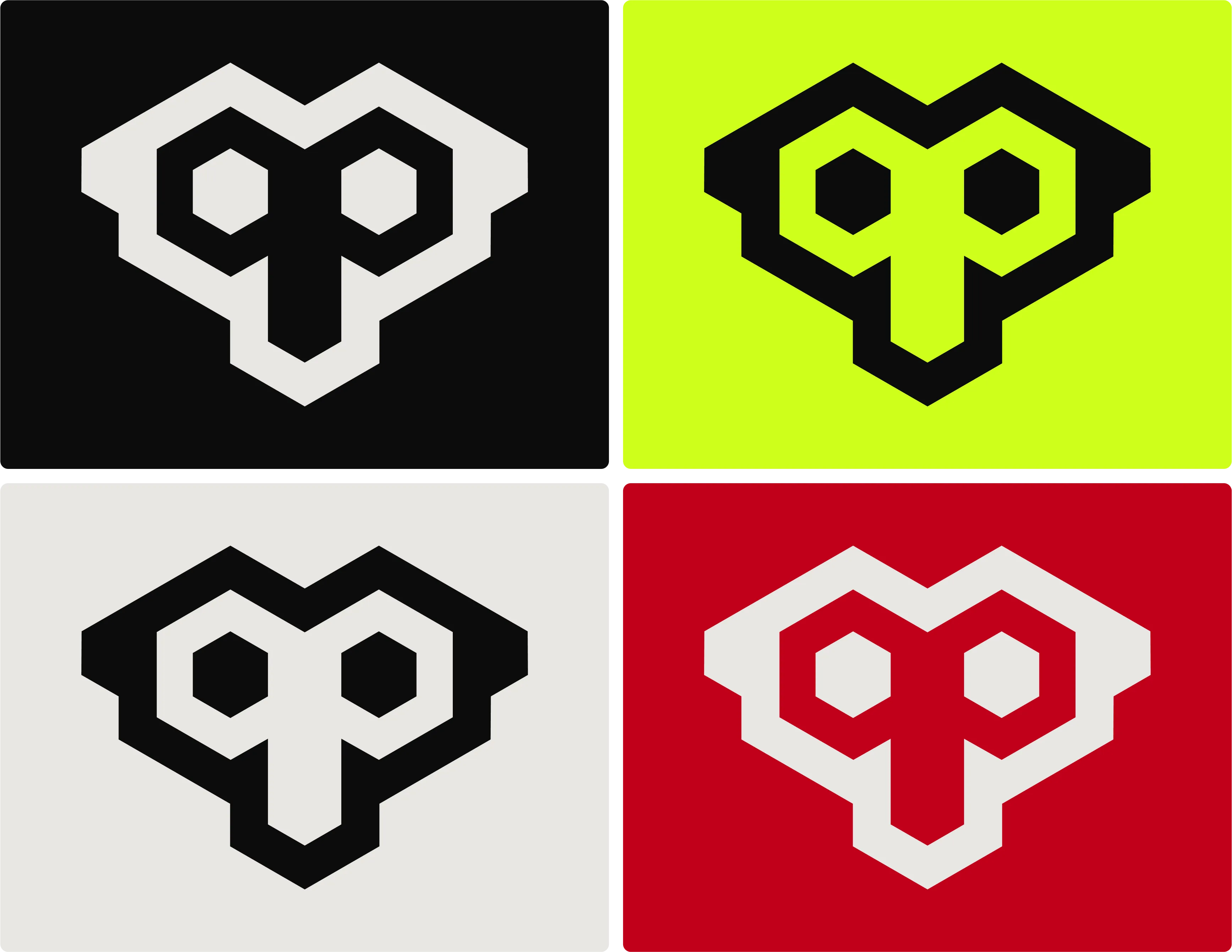
- Shades and Colors: A logo has to work in black and white, not just at different sizes. It should be recognizable without any color. For colors, I try to stick to a maximum of two or three. Too many colors can look inconsistent at different sizes or in grayscale, and harmonizing them is just plain difficult.
- Make a Lot of Them: Creating a logo takes time; you rarely nail it on the first try. So, I make a bunch in my free time. Then I’ll filter them down to my top five, and then filter again until I have a the one i really like. Sometimes I’ll even brainstorm new versions while I’m filtering. I just repeat that process until I land on one I really like.
- The “Gimmick”: You might see the dashed lines in the logo construction image. I see it as a bit of a gimmick. Sometimes I use guidelines to create a logo, but most of the time I don’t. I only used them here for the presentation. Don’t let lines and circles limit your creativity.
- No Rules: Principles are good, but don’t let them limit your expression.
Typography
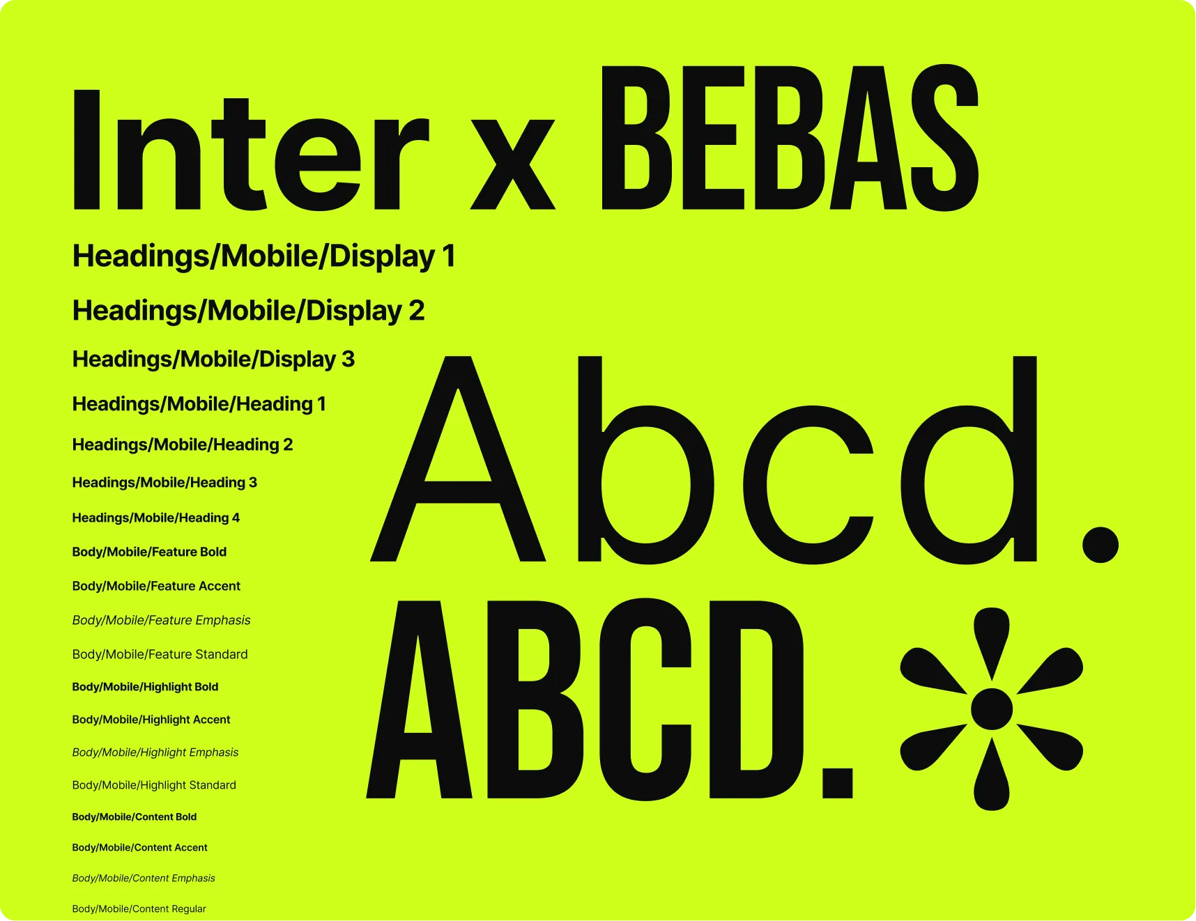
I wanted clean, modern fonts, which is why I chose Inter and paired it with Bebas. Inter is specifically designed for computer screens, which is a huge plus. It’s also a free and open-source font family. For Bebas, I wanted something bold that didn’t look too bulky. To get the line height and letter spacing just right, I used a cool tool called Inter Dynamic Metrics.
Colors
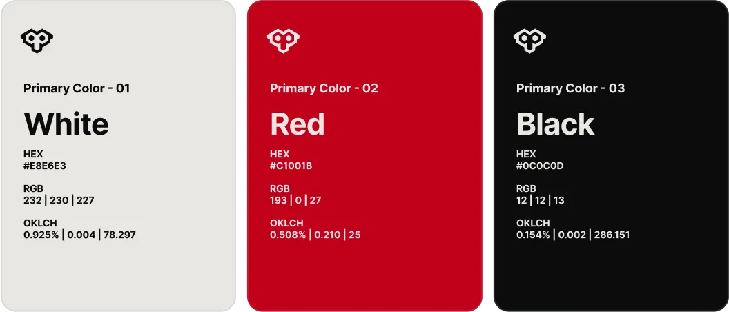
The color scheme is inspired by Tridatu. ‘Tri’ means three and ‘Dhatu’ means element. It’s a symbol with three colors: red for creation, black for preservation, and white for destruction.
Building for Modern Screens
This project primarily uses the OKLCH color space, with some HEX and RGB mixed in. Global browser support for OKLCH is over 92%, which is pretty solid. So, why use OKLCH? It makes working with light and dark modes much easier, and you get a consistent look when playing with the hue.
Color Contrast
But what’s the point of a fancy color space if you can’t read the text? During the design phase, I made sure everything passed the Web Content Accessibility Guidelines (WCAG). I aimed for at least AA and sometimes AAA levels. For checking, I mostly used a WCAG Color Contrast Checker I found online, along with axe DevTools.
UI/UX Prototyping (Figma)
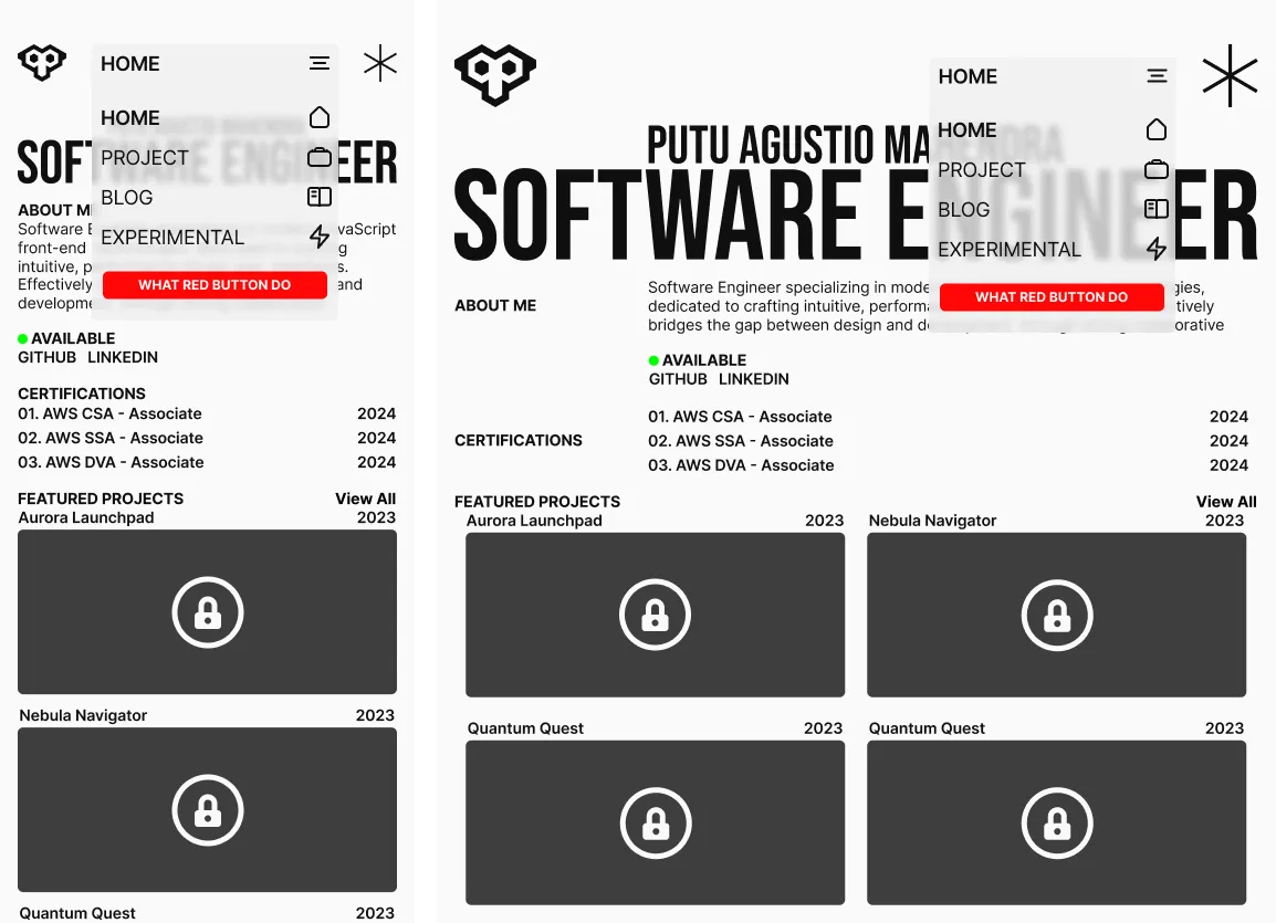
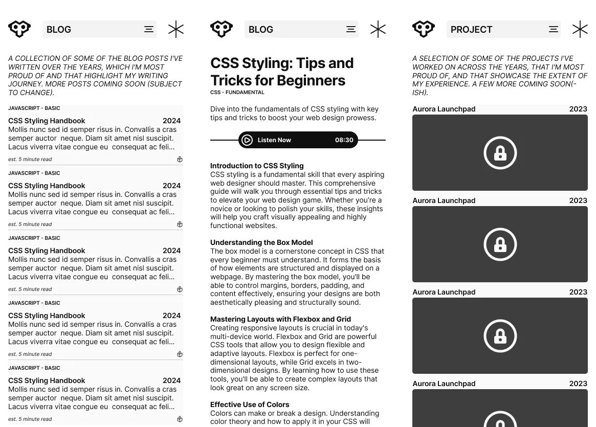
For the early mockups, I took a wireframe-style approach. I used shades and simple shapes but tried not to make it look as primitive as a typical wireframe. This project was also a good excuse to build a mini design system for myself. I leaned heavily into Figma’s features like variables, styles, auto layout, and components with variants.
Technical Architecture
Frontend
Why Astro?
Initially, I just wanted to test out Astro and needed a project to experiment with. I didn’t choose it just for its speed and content-first approach. I was more interested in its flexibility, like bringing in components from other frameworks. I ended up not using that feature and focused more on the content side of things. My favorite Astro features are definitely the file-based routing and its clean component structure.
Interactivity with GSAP and Three.js
At first, I was just using CSS for animations. That was time-consuming, and for complex animations, the code got messy fast. To speed things up, I needed a robust library worth learning. That’s why I picked GSAP. For 3D, I went with Three.js because it’s the king of the 3D web space.
Accessibility
From the start, I wanted this project to be accessible for everyone. Accessibility (often called a11y) was a primary goal. I’m still conflicted, though, because I removed the scrollbar for aesthetic reasons. The browser devtools and the built-in Astro devToolbar were great for spotting accessibility issues along the way.
Optimization and Performance
I spent a lot of time optimizing this project. I manually chunked code, used modern image formats like WebP, and served images at the right size for the screen. I also optimized the 3D objects and set up gzip and brotli compression. The results are solid on both mobile and desktop. The site’s performance would be nearly perfect if not for the complex animations. They’re entirely to blame for the performance hit. I had to make a choice: change the animations or sacrifice some speed for the visuals I wanted. I chose the visuals.
Infrastructure (AWS)
Why AWS?
The only reason this site is on AWS is because I’m familiar with it and wanted to learn more. There are plenty of more straightforward options out there. I’ve used services like Netlify, GitHub Pages, and Cloudflare Pages in the past. Even within AWS, there are tons of ways to deploy a project. For this site, I’m using S3 for storage and Cloudfront as the CDN.
Deployment
Right now, I build the project locally and use the AWS CLI to push it to S3. I use an account with limited permissions for this, and for security reasons, I block all public access to the S3 bucket, allowing it only for CloudFront. Next, I plan to set up automatic builds and deployments on every push or merge.
Implementation Challenges & Key Features
Here are some of the interesting challenges I ran into and the key features of the site.
-
Design Phase (Multiple Pages): Creating a design that works well on both mobile and desktop is tough. I used a mobile-first approach, so I’d perfect the mobile design first. But translating it to desktop always left a lot of empty space. I finally landed on a design I liked after iterating through many different versions.
-
Design Phase (Light/Dark Mode with Colors): The more colors you add, the harder they are to maintain and harmonize. Add light and dark modes to the mix, and the complexity explodes. That’s why I used the OKLCH color space. It let me focus on adjusting the hue instead of juggling a bunch of properties.
-
Development Phase (Animations): As my personal showcase, this site needed great performance. At first, there weren’t many challenges. Everything was great, from performance and SEO to accessibility. Then I introduced the animations.
The animation doesn’t look complex, but building it manually with CSS was a different story. For a simple text hover effect, I had to create a separate element for each letter. Then I’d spend the rest of the day just tuning the animation to get the look and feel right. The real problem was reusing it on text with a different number of letters. The animation I had spent so much time on was useless. Everything would break. I’d have to spend hours, or even a whole day, just re-tuning the timing.
So, I ended up using GSAP. It was faster in every way. It still causes a slight performance hit on mobile, since each letter needs its own element for the smooth effect, and mobile browsers don’t love that. I had to sacrifice some mobile performance for the animation. I think good animation makes a huge difference in how a site feels, which is why I experimented with it. The site was completely static at first, and once everything else was done, it just felt… boring. I know some people prefer that, so I’ve started implementing a way for animations to respect user preferences. That will be fully implemented in the next phase.
-
Deployment Phase: The hard part of deployment was something I dealt with years ago when I first set everything up. So, deploying now is a smooth process. There isn’t much configuration to do these days, except for renewing the SSL/TLS certificate every year and setting up CORS for the custom CSS on my giscus comments.
Outcomes and Future Work
I’m really happy with how it turned out. The next phase will bring a lot of improvements and maybe even some redesigns. I’m calling this a win because it’s the first project I’ve actually finished outside of college. I even followed a software development lifecycle, and just like a real-world project, a lot of things changed along the way.
This project was for experimentation, so not everything ended up exactly as planned. Some things just didn’t scale well. But overall, it was a fun experience. For the next phase, I’ll focus on improving performance even more. It’s pretty good locally, but I’ll need to test it again once it’s live.